Case studies

Blue Court Dental
Blue Court Dental
Blue Court Dental
Blue Court Dental
Blue Court Dental

Blue Court Dental

£0.00

The problem

Blue Court Dental wanted to revamp their entire shop front signage as it was dated and didn't reflect their high quality image. They approached us with their concerns and needed our advice to help recommend the best solution for their business.

The solution

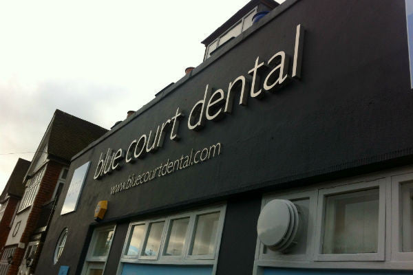
We proposed a more contemporary look and feel for their facade, suggesting a complete change in colour of the building along with stand-off stainless steel lettering to create a much cleaner, more stylish impression. Acrylic panels either side of the lettering helped to reinforce the brand and full colour window vinyls captured attention, added interest and provided a great way to showcase their treatments.

We visualised the ideas so they could see how it would look and then managed the whole production and installation process. The end results is stunning and the client was delighted!

View product
Ella & Fleur Hot Yoga

Ella & Fleur Hot Yoga

£0.00

The problem

Ella and Fleur Hot Yoga have a central Cheltenham location, but the unit was previously lost amongst the more prominent shops either side. Their entrance was a small doorway as the studios are actually situated upstairs and so they needed a solution that helped to provide them with a more permanent presence.

The solution

We created a number of different visuals to help meet their requirements. These designs really helped to illustrate what would and wouldn't work and enabled the client to choose the best solution for their needs.

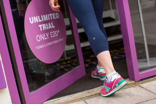
We utilised a tray sign approach with coloured vinyl graphics in order to create a 3D 'frame' around the doorway. This was enhanced with a fret cut, back-lit LED, aluminium projecting sign to give a presence from both ends of the street. The doorway was painted to excatly match the sign colour and striking vinyl graphics were applied to the glass panes to promote specific offers and enhance the visual identity.

The result is a more prominent store-front that fits in with the rest of the businesses, creating a highly professional look to help the studio stand out. 

View product
iQ Orthodontics
iQ Orthodontics
iQ Orthodontics
iQ Orthodontics
iQ Orthodontics

iQ Orthodontics

£0.00

The problem

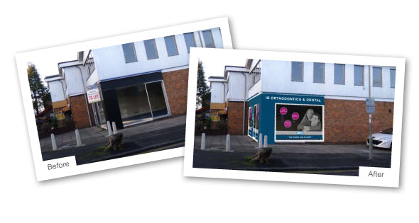
Our client was moving in to an empty unit and was remodelling the outside of their new dental practice. They needed signage to fit in with the building, to show off the brand and to advertise the different services available.

The solution

We created a series of design visuals to illustrate the suggested exterior of the new practice. We created two fascia panels for the front and side elevations and powder coated these in the corporate, Pantone blue. We then fixed built-up foamex lettering for name to add depth and texture. The main logo sign panel overlapped the fascia to help attract attention and to break up the lines. The main signs had an illuminated trough light to help them 'glow' at night.

We finished off the exterior with vinyl window and door graphics and modern name plaque. We also carried the design through to the inside with stylish cut vinyl lettering to label the different rooms within the practice.

The client was delighted with the outcome and the signage has helped the practice to go from strength to strength.

View product